Konrad Sybilski
Info+Contact
konradsybilski@gmail.com
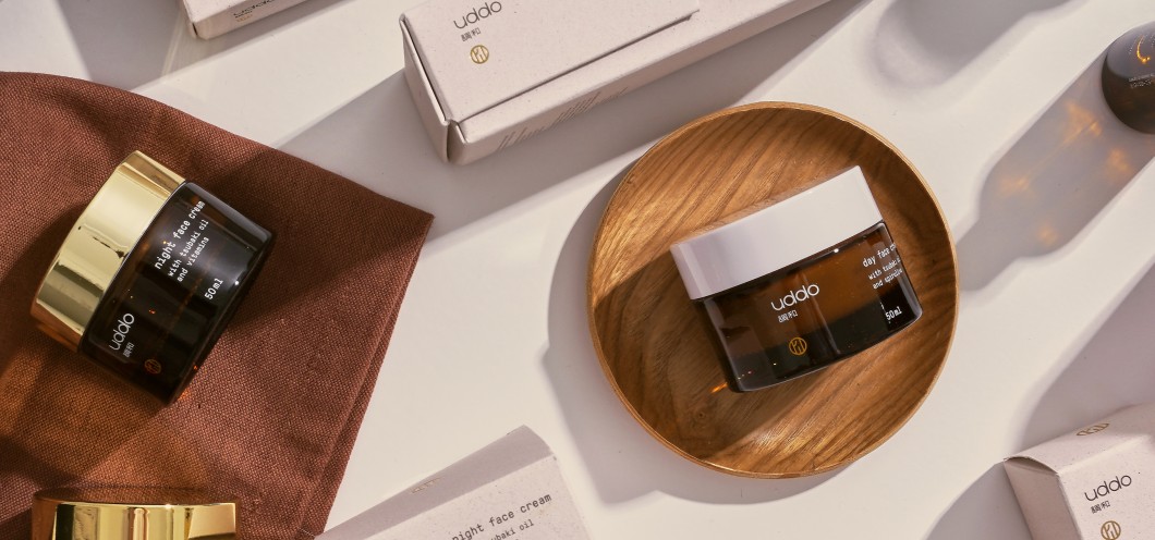
Uddo
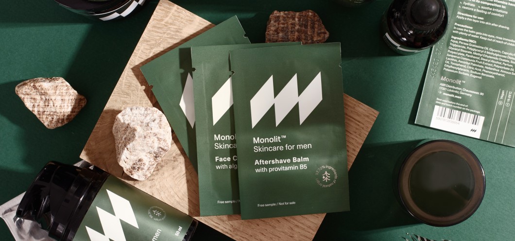
Monolit
Żywa Cultura
Dunst
Mercator Medical
Zuo Corp +
Any Tea
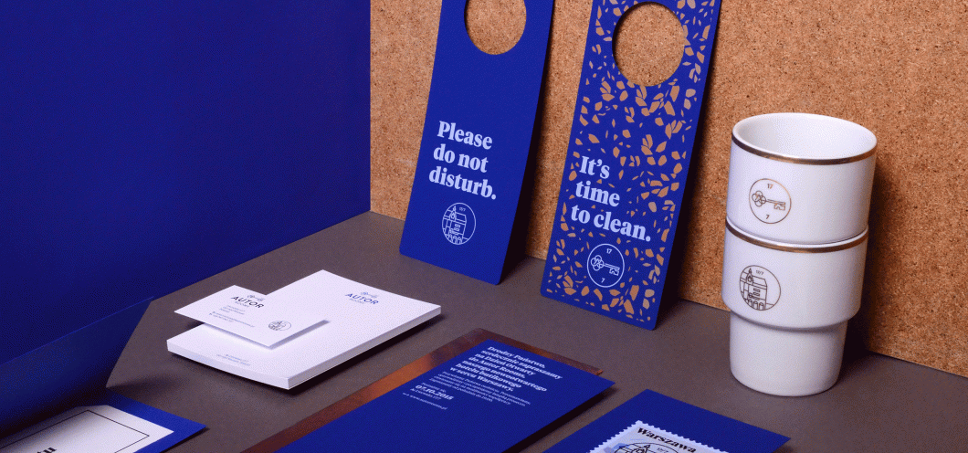
Autor Rooms
Logotypes
Ceramic City
Kuchnia Pasjonata
Raw Fairies
Arthur Rubinstein Philharmonic
Muse
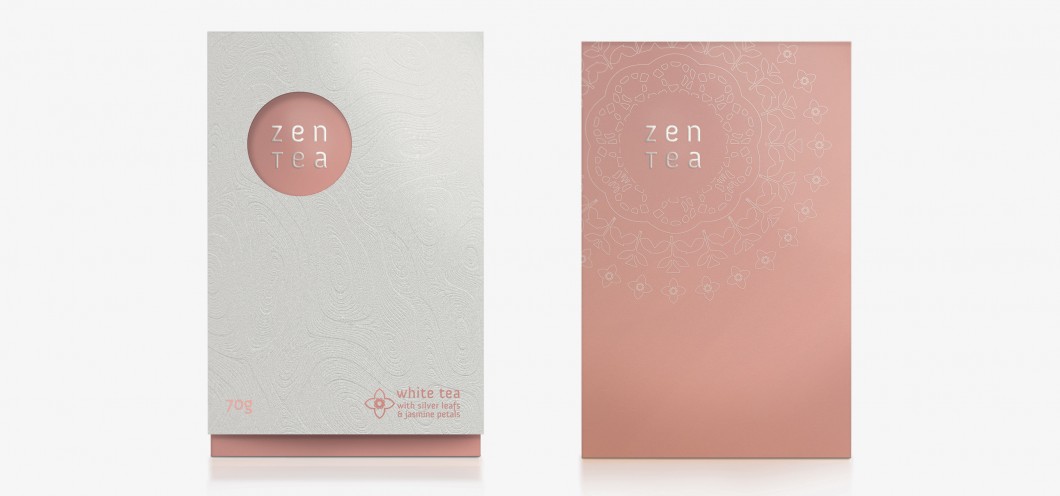
Zen Tea
Old Portfolio
Falling Fruit
Ricenoir Sake
Oilah
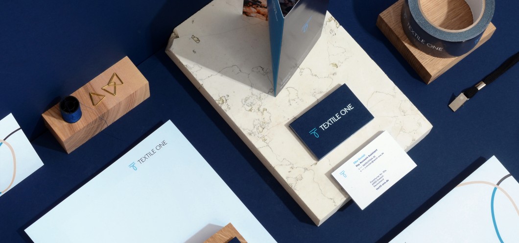
Textile One